As a freelance Data Analyst, I was hired by an NYU instructor preparing her promotion application. My mission: transform six years of fragmented student evaluation data into actionable insights and presentation-ready visuals. Through deep data cleaning, exploratory analytics, and a collaborative, results-driven approach, my work empowered the client to clearly demonstrate her teaching impact—and directly contributed to a successful promotion and a $15,000/year salary increase.
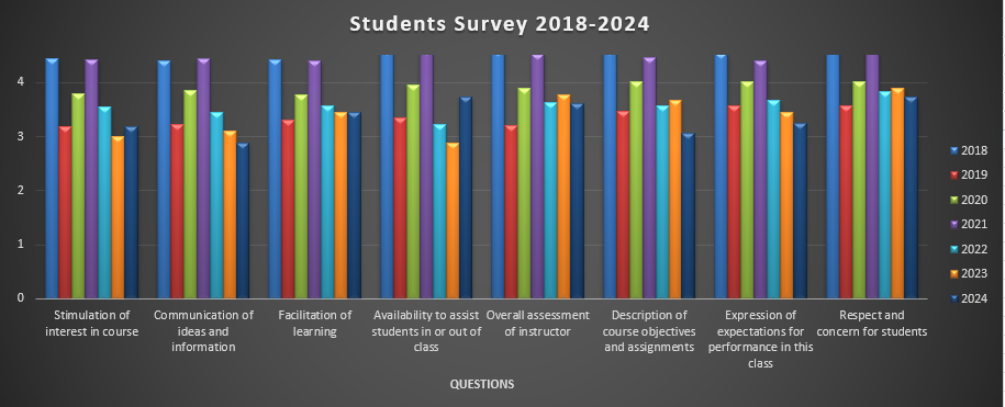
The client brought me raw Excel files spanning 2018–2024, containing student ratings for multiple courses and teaching categories. The datasets had considerable missing values and inconsistencies, especially in response rates and category totals. The key challenge was to distill this noisy data into clear, convincing graphics and tables that would fit within a strict two-page limit for a faculty promotion review board—showcasing excellence and progress, even in challenging years.
- Advanced Data Cleaning: The original data required significant wrangling—many fields were missing or incomplete, with student ratings not always adding up to 100%. I applied robust data cleaning techniques, managed null values, and engineered logical assumptions (e.g., treating missing responses as “no response”) to standardize the dataset, ensuring all downstream analytics were reliable.
- Exploratory Data Analysis (EDA): Using EDA and statistical summaries, I identified which courses, terms, and teaching dimensions were most favorable. By calculating weighted means, analyzing year-over-year progress, and mapping outliers, I found the most compelling story to tell the review board.
- Stakeholder Collaboration: I held regular check-ins to clarify objectives, define “success” (75%+ in “Excellent/Very Good”), and iterate on visual design. My consultative style ensured the client’s unique achievements stood out—while I proactively managed data limitations and communicated the “why” behind each visual choice.
- Excel Power Tools: Leveraging advanced Excel (Pivot Tables, dynamic charts, error bars), I delivered both high-level overviews and detailed breakdowns. My charts were fully editable, enabling the client to fine-tune colors and styles for her application.


To respect client privacy and intellectual property, only selected sample charts are shown here; the final full dashboard and report are not public.